Packaging
“If they cost the same, which would you pick off the shelf?” Add a rating for how easily the product name can be read.
DESIGN COMPARISON
Show two to four logos, packs, mockups or concepts to your audience. People can choose a favourite, explain why, name their runner-up or rate an option out of 5.
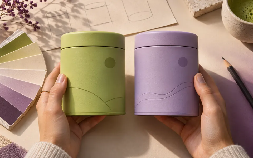
Give the respondent a situation and a criterion. Choosing a pack on a shelf, recognising a logo and understanding a mockup are different decisions.
“If they cost the same, which would you pick off the shelf?” Add a rating for how easily the product name can be read.
“Which do you recognise most easily at this size?” Compare the logos at the same scale.
“Which one communicates the message fastest?” Show each page, banner or thumbnail as it would appear on the same device.
For more on comparing design options, see UserTesting’s definition of a preference test.
A preference test asks people to compare options directly. In a website A/B test, different groups see one version each and you track an observable action such as a click or purchase.
VIFLY Pulse supports two to four options, with or without images. Results show the vote and rating counts for each. You can filter reasons and suggestions by voter group.
Share the link with the people whose feedback you want. Choose respondents who fit your target audience. For a retail product, think about the shelf, price and purchase situation.
Want to check the concept first? Run a business idea test.